


|
||

|

|
|

|
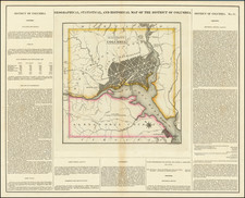
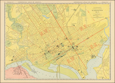
Fascinating epidemialogic map of Washington DC, illustrating the total number of deaths in each city square, with the deaths of white persons indicated by numbers in red and those of colored persons by numbers in blue. This map is indicative of a time when racial demographics and health statistics were presented in a segregated format, a reflection of the societal norms and systemic segregation prevalent at the time of its creation.
The map of Washington D.C. was part of a series of epidemiologic maps included in the annual reports to Washington D.C. city commissioners from 1878 to 1909. These maps were innovative tools for demonstrating the impact of contagious epidemic diseases on the population of Washington D.C. They served to graphically chart information that was also represented in statistical tables within the reports, providing a visual representation of health-related data that was previously unavailable in such an accessible format.
The creation of these maps was spurred by the urgent need to address public health crises during a time when diseases such as diphtheria, scarlet fever, typhoid and malarial fevers, smallpox, tuberculosis (referred to as consumption), and various diarrheal diseases were rampant. The public health officers of the District of Columbia sought to use these maps as a means to communicate the severity and distribution of these illnesses across different regions of the city. By visualizing the data, the maps helped to identify patterns and hotspots of disease outbreaks, which were essential for implementing targeted public health interventions.
The period between 1878 and 1909 was also a time of significant change in the understanding of disease etiology and transmission. The health officers responsible for these maps were grappling with these concepts themselves, as germ theory became more widely accepted and replaced earlier miasma theories of disease. The maps provided evidence-based support for the burgeoning understanding that diseases were caused by specific agents and could spread from person to person, or through water, air, or vectors. This understanding was pivotal in shaping public health responses and strategies.
Furthermore, the impact of these maps extended into the legislative arena. The stark visual evidence of disease prevalence and distribution they provided helped catalyze the enactment of laws requiring mandatory reporting of cases and deaths from critical diseases by Washington D.C. physicians. This was a significant step forward, as it led to more systematic data collection and better-informed public health decision-making. The maps thus served not only as tools for immediate disease mitigation but also as catalysts for longer-term structural changes in public health policy and practice. They remain important historical documents, shedding light on the evolution of epidemiology and the visualization of public health data.
![[ Epidemiology Map ] Map of the City of Washington](https://storage.googleapis.com/raremaps/img/small/99287.jpg)